library(tidyverse)
library(here)
library(janitor)
library(readxl)
pickleweed <- read_csv(here("data", "salinity-pickleweed.csv"))
personal_data <- read_csv(here("data", "personal_data.csv"))Homework-03-ENVS-193DS
https://github.com/MarkVelthoen/ENVS-193DS_homework-03
Problem 1. Slough Soil Salinity
library(tidyverse)
library(here)
library(janitor)
library(readxl)
pickleweed <- read_csv(here("data", "salinity-pickleweed.csv"))
personal_data <- read_csv(here("data", "personal_data.csv"))
a) In order to determine the strength of the relationship between salinity and California pickleweed biomass there are two appropriate tests, Pearson’s Correlation and Spearman’s Correlation. Pearson’s Correlation measures the strength and direction of a linear relationship without assuming one variable causes the other. Spearman’s Correlation is very similar, as it measures the strength and direction of the monotonic relationship between two ranked or continuous variables.
b)
ggplot(pickleweed, #using pickleweed dataframe to create a plot
       aes(x = salinity_mS_cm, #making soil salinity the x-axis
           y = pickleweed, #making pickleweed biomass the y-axis
           color = "red")) + #coloring the points red
  geom_point() + #plotting the points
  labs(y = "Pickleweed Biomass (g)",
       x = "Soil Salinity (mS/cm)",
       title = "Soil Salinity vs Biomass") +
  theme_classic() + #adding title, x+y axis labels ans setting the theme
  theme(legend.position = "none") #removing legend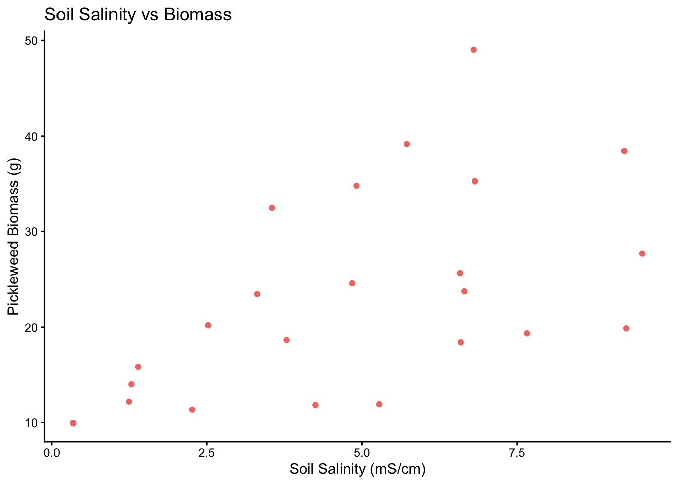
c)
ggplot(data = pickleweed,  #using pickleweed  dataframe to create a plot
       aes(sample = pickleweed)) + #y-axis for qqplot is pickleweed biomass
  geom_qq_line(color = "blue") + #showing reference line in blue
  geom_qq()  # adding our observations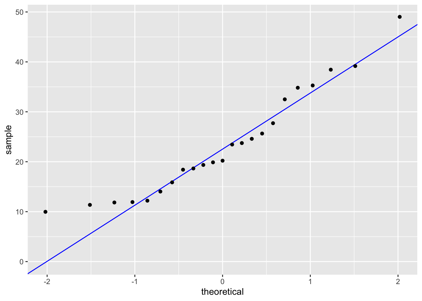
ggplot(data = pickleweed,  #using pickleweed  dataframe to create a plot
       aes(sample = salinity_mS_cm)) + #y-axis for qqplot is soil salinity
  geom_qq_line(color = "blue") + #showing reference line in blue
  geom_qq()  # adding our observations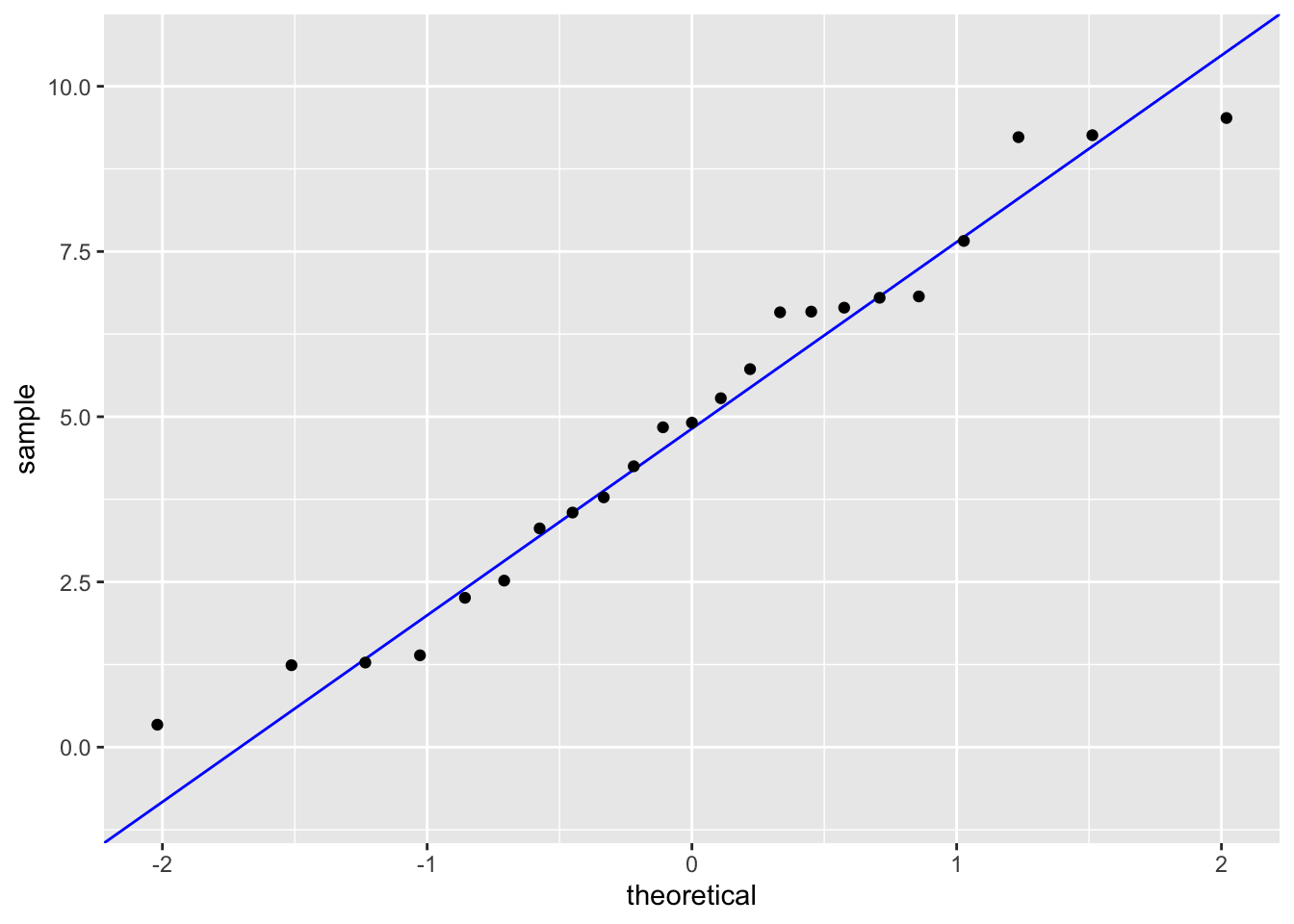
cor.test(pickleweed$pickleweed, pickleweed$salinity_mS_cm,
         method = "pearson")
    Pearson's product-moment correlation

data:  pickleweed$pickleweed and pickleweed$salinity_mS_cm
t = 2.8979, df = 21, p-value = 0.008605
alternative hypothesis: true correlation is not equal to 0
95 percent confidence interval:
 0.1568265 0.7757682
sample estimates:
      cor
0.5344778
In order to run a Pearson’s Correlation test, we must check the assumptions of linearity and normality. I checked the assumptions by plotting soil salinity vs biomass and making a qq-plot for each variable respectively. There definitely appeared to be a linear relationship between soil salinity and biomass, both variables followed the reference line in each qq-plot and the residuals followed the qq-plot reference line. This shows that our assumptions are valid.
d) To evaluate the strength of the relationship between pickleweed biomass and soil salinity, I used a Pearson’s Correlation test because both variables are continuous and the assumptions of linearity, normality and homoscedasticity were met. We found a positive moderate relationship between pickleweed biomass and soil salinity (Pearson’s r = 0.53, t(21) = 2.9, p = 0.01, α = 0.05)
e) After running Pearson’s Correlation, we determined that there is a positive moderate relationship between soil salinity and pickleweed mass. This means that we should prioritize planting pickleweed in areas with higher soil salinity.
f)
cor.test(pickleweed$pickleweed, pickleweed$salinity_mS_cm,
         method = "spearman")
    Spearman's rank correlation rho

data:  pickleweed$pickleweed and pickleweed$salinity_mS_cm
S = 824, p-value = 0.003426
alternative hypothesis: true rho is not equal to 0
sample estimates:
      rho
0.5928854
Yes, the two tests, Pearson’s and Spearman’s, would have led me to make the same decision, to reject the null hypothesis (there is no correlation between pickleweed biomass and soil salinity) because both p-values are significant (0.01 and < 0.01 respectively). Similarly, both tests also indicate a moderate positive relationship between pickleweed biomass and soil salinity (r = 0.53 and 0.59 respectively).
Problem 2. Personal Data
a)
df2 <- personal_data |> #creating a new data frame from my personal data
  mutate(workload_cat = case_when( #mutating and creating a new variable workload_cat
      `Workload (hours)` <= 3 ~ "Low (0–3 hours)",
      `Workload (hours)` > 3 & `Workload (hours)` <= 6 ~ "Medium (>3–6 hours)",
      `Workload (hours)` > 6 ~ "High (>6 hours)"), #changed the continuous values into three categories, low, medium and high workload
    workload_cat = factor(
      workload_cat,
levels = c("Low (0–3 hours)", "Medium (>3–6 hours)", "High (>6 hours)"))) #ordering the categories so it goes from low to highggplot(df2,
aes(x = workload_cat,
fill = `Type of ocean activity`)) + #creating a plot with workload category on the x-axis
geom_bar(position = "dodge") + #making the barplots fall next to each other in each bin instead of stacking on top of one another
labs(title = "Ocean Activities by Daily Workload Category", #creating the labels
x = "Daily Workload Category (hours)", #x-axis label
y = "Count of Days", #y-axis label
fill = "Ocean Activity") +
scale_fill_brewer(palette = "Set2") + #coloring in each box based on ocean activity
theme_classic() #setting the theme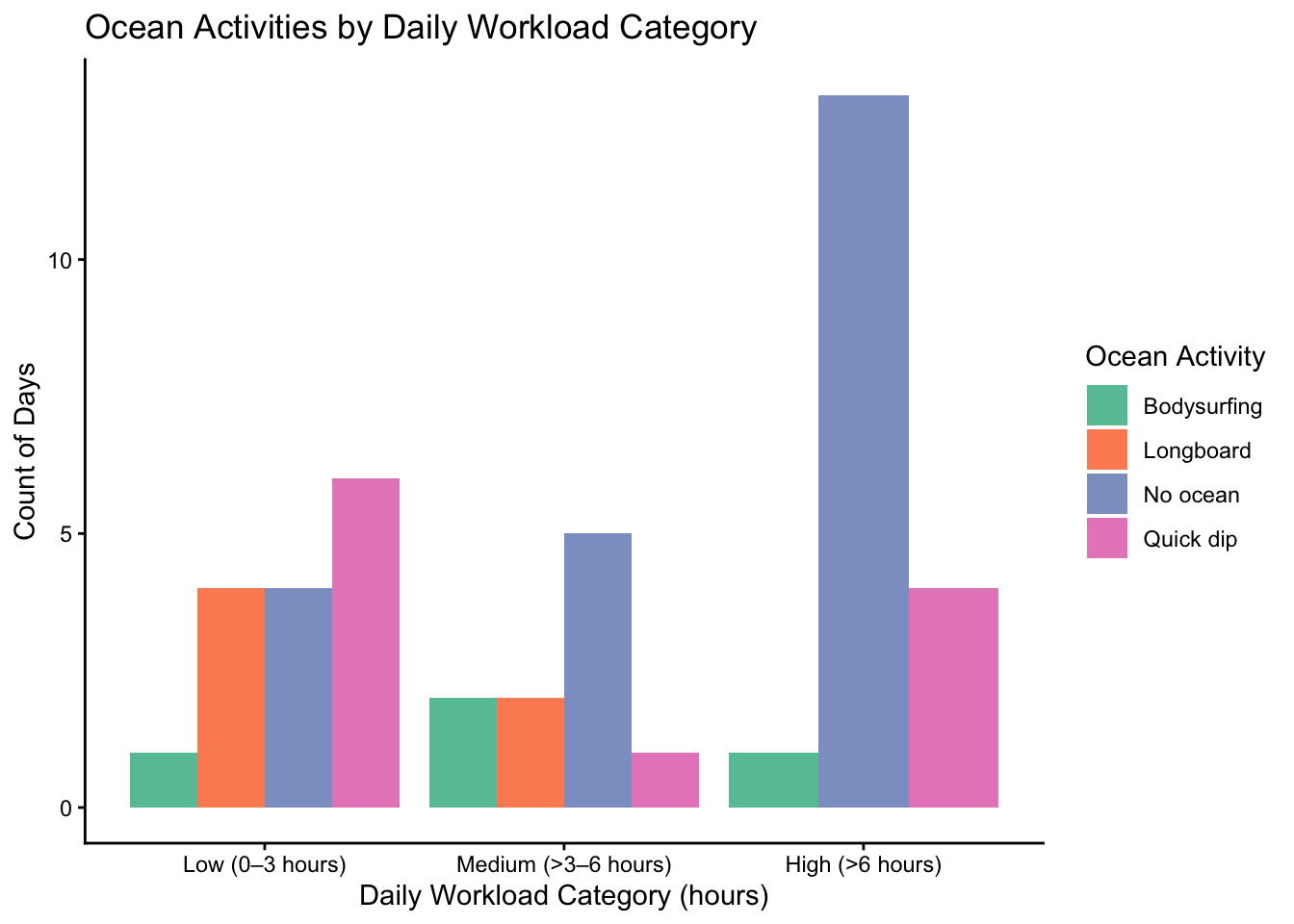
ggplot(data = personal_data, #creating a plot using my personal data
aes(x = `Workload (hours)`, #setting the x-axis to daily workload or not
y = `Ocean`)) + #setting y-axis to whether I hopped in the ocean
geom_jitter(height = 0,
              width = 0.1, #jittering the points horizontally
color = "blue") + #coloring each point
  labs(title = "Impact of Daily Workload on Ocean Visits",
       y = "Ocean Visit",
       x = "Daily Workload (hours)") + #creating the labels for the x and y axis as well as the title
theme_minimal() #setting the theme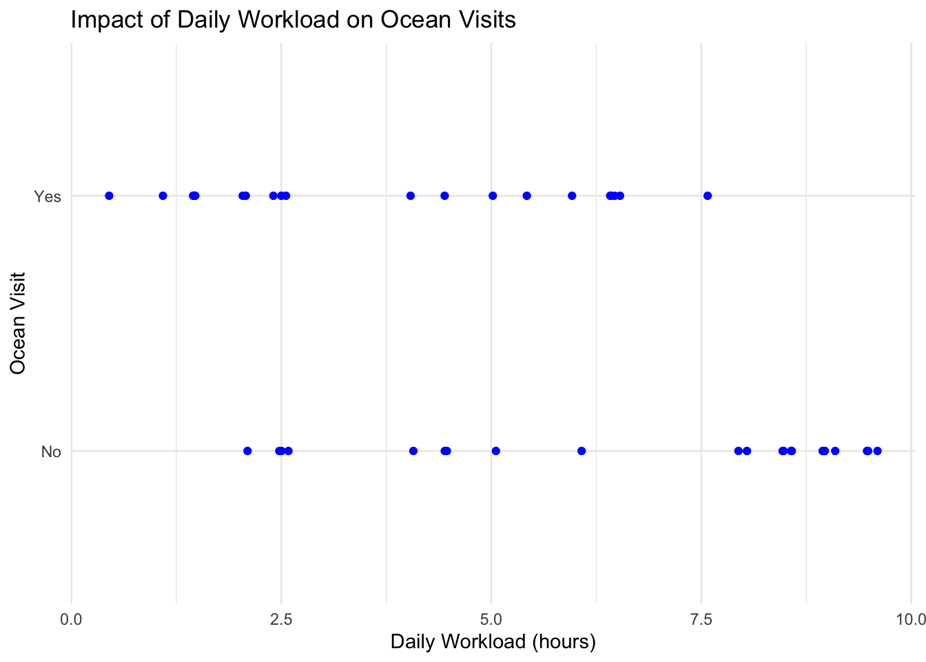
b)
Figure 1: Ocean Activities by Daily Workload Category: This figure shows a box-plot, split into three categories on the x-axis (low workload, medium workload and high workload), containing up to four bars, with each bar corresponding to a unique ocean activity (no ocean, quick dip, body surfing and long boarding). The y-axis is simply number of days or count.
Figure 2: Impact of Daily Workload on Ocean Visits: This figure is a jitterplot with daily workload (hours) on the x-axis and a categorical y-axis which indicates whether or not I went in the ocean. Each blue dot corresponds to a specific day in my data set.
Problem 3. Affective Visualization
a) Based on Figure 1: Ocean Activities by Daily Workload Category, I like the idea of separating workload into three categories (low, medium and high) and showing how my ocean activites differ for each workload category. I think that having some sort of visual metaphor/representation for each category and type of ocean activity would be a fun way to differentiate all the results. For example, creating a landscape/backdrop of a beach with four separate sections: large waves (long boarding), smaller waves (body surfing), the beach (quick dip) and a section on the bluffs that corresponds to no ocean activity. I could then place points onto each section of the backdrop with a color or some form of visual representation to differentiate between each workload category.
b/c) (Sorry, I just combined the sketch and draft into one. Hope that is okay.)
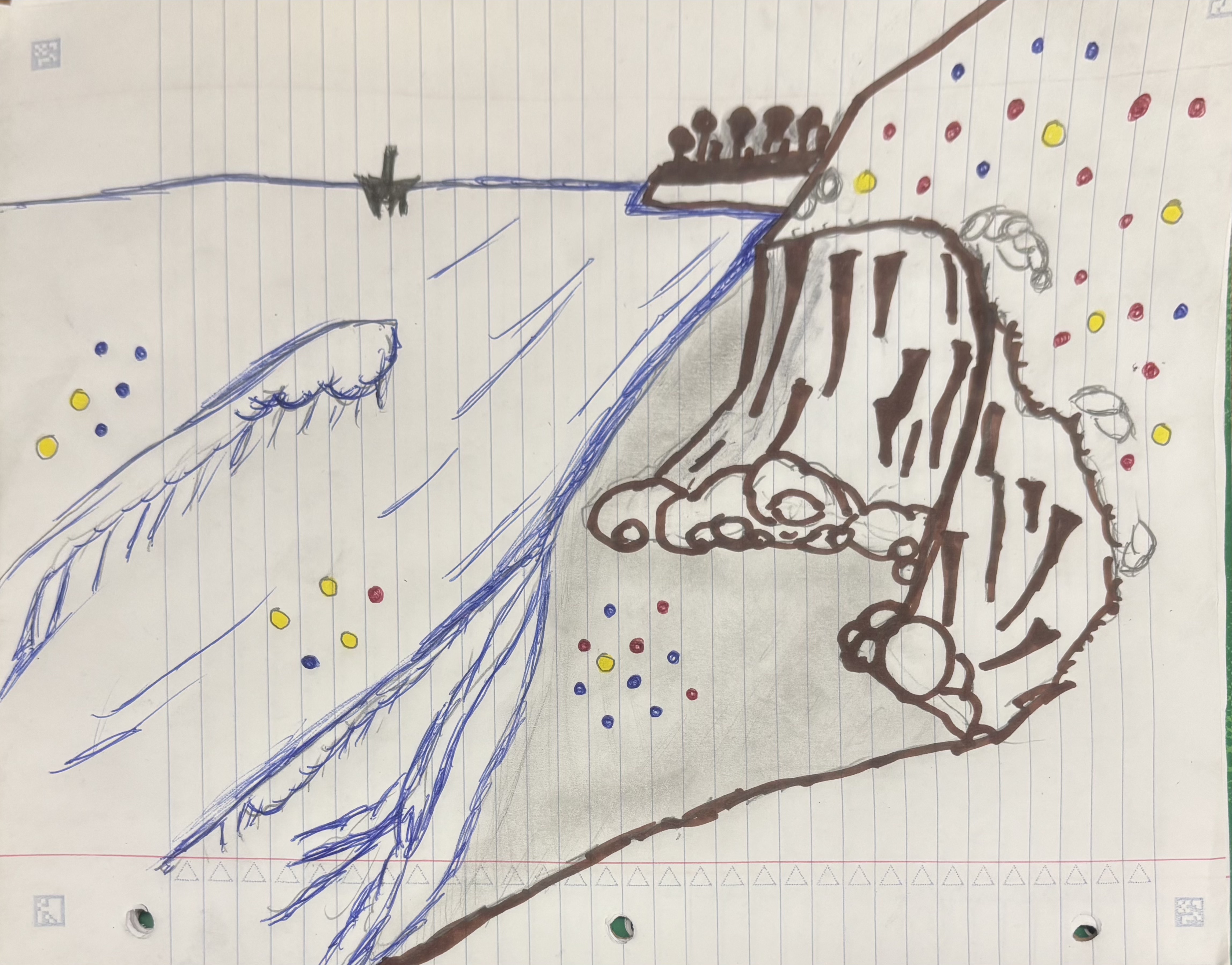
d. This piece is a visual representation of personal data that I have collected over the past month and a half. Each colored point represents a day and the color corresponds to a daily workload category (blue = < 3 hours of work, yellow = 3 - 6 hours of work, red = 6+ hours of work). The location of each point represent an ocean activity I did that specific day (on the bluffs = no activity, on the beach = quick dip, in the shore break = body surfing, past the wave = long boarding). I took a lot of inspiration form Jill Pelto’s paintings, as she incorporates a lot of landscapes and backdrops into her data visualization. The draft is simply a sketch, but for the final draft I plan on making a watercolor painting. The process was fairly simple, the hardest part was definitely deciding how I was going to visualize my data. However, I think I landed on a cool idea. I first drew the landscape/background, then I added color and finally I added my data points to their respective locations.
e.
https://docs.google.com/presentation/d/10Z4PC2I8VR4Q52l-N6mVNy8DuwPpkmw0r3UYu9V9h9Q/edit?usp=sharing
Problem 4. Statistical Critique
a) The statistical test included in this paper is ANOVA (Analysis of Variance) as well as PCA (Principal Component Analysis). The response variables are the water quality parameters (pH, Dissolved Oxygen, and E. coli). The predictor variable is the season.
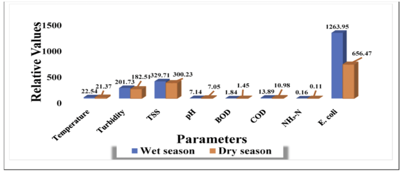
b) The authors present their statistics fairly clearly in the figure. The x-axis lists the water quality parameters, while the y-axis represents the concentrations of those parameters. This allows for easy comparison between wet and dry seasons. Seasonal differences are visually distinguished using separate colored bars, which helps highlight patterns such as the large change in EColi. However, the figure shows only summary values and does not display variability, such as standard error or the underlying raw data.
c) The authors handle visual clutter fairly well because the figure is simple and focuses mainly on the important data, making it easy to compare the wet and dry season values across the different water quality parameters. The data:ink ratio is relatively high since most of the visual elements are used to display the bars and values. There are also minimal extra details, only labels and color differences for the two seasons.
d) I would recommend adding error bars (SE or SD) to show the variability in the data. I would also recommend simplifying the figure by taking out the values above each bar, as the y-axis is labeled with units. Finally, separating some parameters with very different scales (such as EColi) into a different graph could make the smaller values easier to compare.